|
Tomorrow I'm having an opening show in the Huntsville Library. It will be up until the end of December. I'm really excited, it is this beautiful little town that is kind of its own little world. I used to live there when I was little, and I'm excited for the opportunity to show there. Thanks Faith for all of your help!
0 Comments
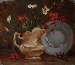 These wild flowers were growing just down the street and I had to paint them. I love painting from life, sometimes there are fewer challenges than from photos, and I get more life in my paintings when I paint from life (: but in this case there was the challenge of painting these before they started to wilt. I decided to just roll with it and paint them as they wilted. I like the result.
Last year at the National Portrait Conference Richard Schmidt was talking about painting flowers and shrubbery and said something to the effect that the trick to making your still life work beautiful and lifelike is to include all of the things that you would think don't fit, like dead leaves and wilting flowers. 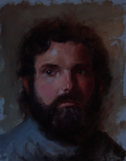 I really like the way that this portrait turned out. I loved doing the dramatic difference of lighting on his face, and how much it really changed the color of his skin.
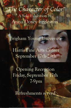
Next month I will be featured in a great little gallery on Historic 25th street in Ogden, Utah.
There will be a Gallery Stroll the first Friday, November 5th from 6-9pm, and my work will be hanging all month. For those of you who went to my show in Provo, there are some works that are the same and some new ones too. Hope to see you all there! http://www.fineartson25th.com 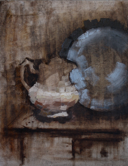 This is a still life that is still on my easel. I'll keep you updated on the progress of it.
These two paintings I did using Burnt umber, raw sienna, ultramarine blue and titanium white. I really like how they turned out, I think they have kind of a soft olden-day quality. (:  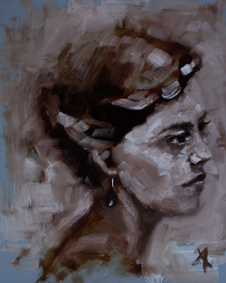 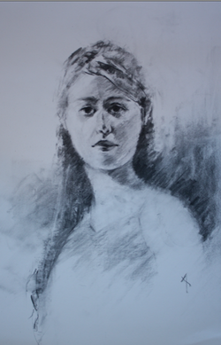 This is a drawing I did this week. I love vine charcoal because it is very forgiving.
I have been trying this new technique using linen. Instead of stretching it with a wood frame, I have been mounting it onto Gatorboard. This board looks like foam board but it is very hard and archival. William Whitaker introduced me to it. I have been using it for a while as a board behind my drawings because it is hard enough to draw on, but it has a little bit of give, so you don't have to have a big stack of papers behind the one you are drawing on to soften your surface a little bit. It is also great for behind Frosted Mylar, which is a wonderful painting surface, and also archival. Here is a pic of the Gatorboard with the linen mounted on it. I cut the linen to about the right size for the board, then I covered the board with gesso and mounted the linen using a credit card, starting from the middle and pushing out to the edges. It stretches the linen also, then I put a thin layer of gesso on top to seal it, then trimmed up the edges. I have really enjoyed painting on it, it has the great linen texture, but the board is very lightweight and thin. Save space and if you are shipping your work, this would save a lot on shipping costs! 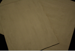 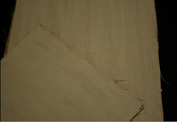 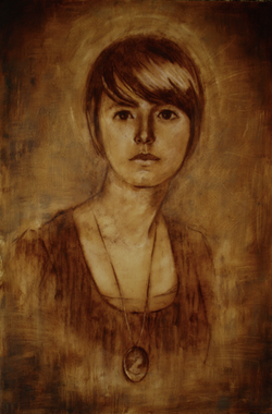 This painting was difficult because it was so hard trying to find how to really pop the flowers and push the shadows back, but also push the other side of the flowers back so there would be more depth within the flowers. I pushed the back petals by adding blues and purples, then the shadows are very purple too. Fun stuff! 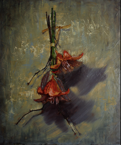 This one I really need to thank Greg Newbold for helping me with (He was my mentor for my show and helped me a TON! Thank goodness for better artists!) My colors weren't matching very well for some reason, they just weren't meshing but then Greg suggested I do a glaze over the top as well as add in a few touches of color here and there to bring the painting together, following the rule of odd numbers. It completely changed with painting and added a "togetherness" to all the colors.  I had the best breakthrough on these two portraits! Especially the one right below, which was really interesting because this was the last portrait that I did for the show. Hold out until the end and then the reward comes! (: My breakthrough was that I worked from the top down so that instead of focusing on the entire shape that one stroke of paint should be, I only worried about the shape of the top and sides, then I would go back in with my next color and correct the bottom of the shape. Does that make sense? For example, on the eyes I laid down a thick dark stroke for her lashes, then went back in with the color of the iris and corrected the shape of the lashes while also laying in the shape of her iris. I worked the whole portrait this way, working down and layering one shape on top of another. I loved it! I also had a lot of fun with the abstract shapes in the background, thanks to Mary Sauer who gave me the idea in her painting "Levi II" Thanks Mary! www.marysauer.blogspot.com  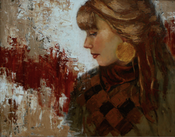 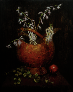 This painting of Cora was really fun. I found a scrap piece of wood in my Dad's garage and drew on it first, then did the painting. It was more of a have-fun painting. I tried new techniques and was a little more relaxed with it. I wanted to try something new with a design in the background, and the colors in the portrait are unlike any portrait I have done before. It was taken with a very warm light and her orangey shirt reflected the coolest colors onto her cheek. Way fun!  On these three portraits, I wanted to try something new with patterns, so I added paper on all of them. I had so much fun and I really like how they turned out. Its so much fun experimenting and I learned new things to try on my next ones.  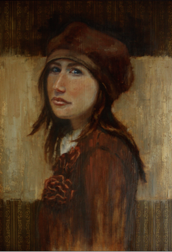 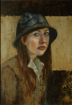 These two still lifes were really fun. I did a vertical design with gesso so that when I did a dry brush technique on top it left this cool vertical pattern on the ridges. I really liked it. It also accentuated the vertical design. 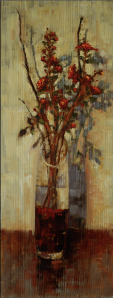 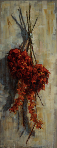 The show opening went really well, we had a lot of people that made it out. Thanks to everyone who came! Pics are coming soon of the opening, right now I'm just posting the new paintings. Hope you enjoy!
|
ALL IMAGES © ANNA EGGLESTON 2017ArtistGraduated from BYU with a BFA. Apprenticed with world renowned artist William Whitaker. I live in Georgia with my husband and three children. 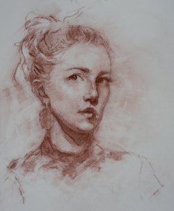 Archives
February 2018
Categories
All
|
 RSS Feed
